Magazine Drafts:-
Below is three drafts for my magazine front cover, when creating drafts of my magazine front cover I got inspiration from successful film magazines such as Empire, Entertainment and Film. The majority of magazines only feature one model as the main focus of the magazine who stars in the latest film. Therefore I decided on this basis that for my magazine front cover I would only have one model. The model I have chosen to feature is the actor Ricardo Vieira who plays Ricky in my film trailer "Obses." The main image on magazines such as Empire and Film take up predominately the whole page so when creating my magazine front cover drafts I have made the main image take up the whole page following the conventions of a film magazine front cover. I have decided on the name "MOVIE" for my magazine front cover due to the fact that film magazine names relate to the film industry therefore I believe the name "MOVIE" will be an effective name that will appeal to my target audience. In addition to this, I have included other conventions of a magazine front cover such as stickers, the main article title, coverlines, the barcode, date line and so on. The main article featuring on my magazine cover is about the film trailer I have recently made alongside my magazine cover and film poster. Therefore my coverlines are articles to do with other latest films that have been released or about to be released that will appeal to my target audience. The masthead font which I decided to go with in my final draft needs to be iconic to my magazine "MOVIE." As well as the house style colours in which I decide on need to be consistent as well as colours which connote danger and fast paced action following the conventions of an action thriller film.
Below is three drafts for my magazine front cover, when creating drafts of my magazine front cover I got inspiration from successful film magazines such as Empire, Entertainment and Film. The majority of magazines only feature one model as the main focus of the magazine who stars in the latest film. Therefore I decided on this basis that for my magazine front cover I would only have one model. The model I have chosen to feature is the actor Ricardo Vieira who plays Ricky in my film trailer "Obses." The main image on magazines such as Empire and Film take up predominately the whole page so when creating my magazine front cover drafts I have made the main image take up the whole page following the conventions of a film magazine front cover. I have decided on the name "MOVIE" for my magazine front cover due to the fact that film magazine names relate to the film industry therefore I believe the name "MOVIE" will be an effective name that will appeal to my target audience. In addition to this, I have included other conventions of a magazine front cover such as stickers, the main article title, coverlines, the barcode, date line and so on. The main article featuring on my magazine cover is about the film trailer I have recently made alongside my magazine cover and film poster. Therefore my coverlines are articles to do with other latest films that have been released or about to be released that will appeal to my target audience. The masthead font which I decided to go with in my final draft needs to be iconic to my magazine "MOVIE." As well as the house style colours in which I decide on need to be consistent as well as colours which connote danger and fast paced action following the conventions of an action thriller film.

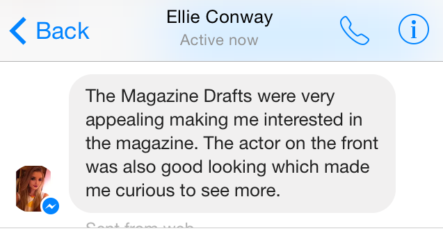
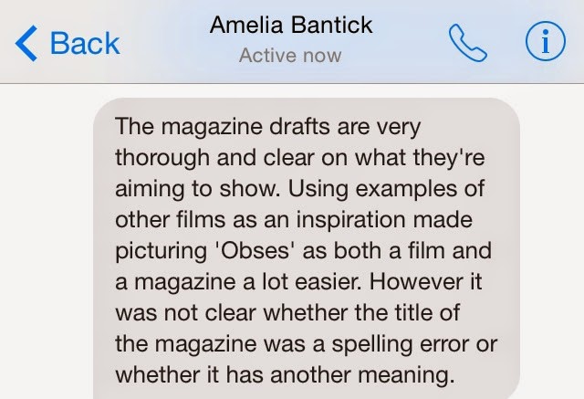
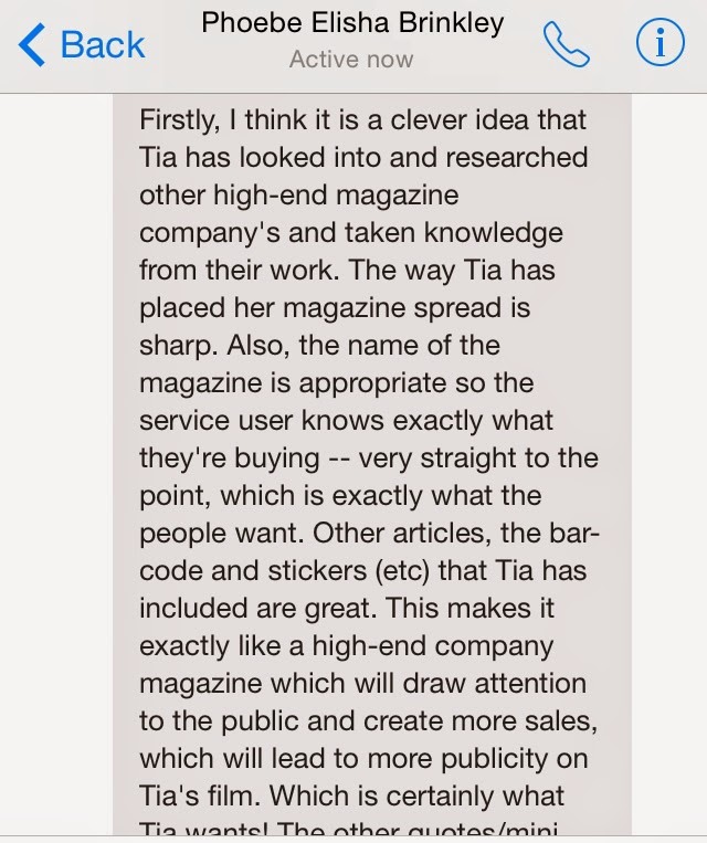
After creating my drafts for my magazine front cover I got feedback from my target audience:
Below is my final draft for my magazine front cover. When constructing my magazine front cover I got inspiration from the front covers of Entertainment magazine. By looking at a successful magazine front cover with Daniel Craig as the main image/focus who is globally known for starring as James Bond in the James Bond franchise I decided to follow the conventions of the Empire magazine front cover by having Ricardo Vieira playing Ricky in "Obses" as the main image on my front cover. The image of Ricardo will take up predominately the whole page which will appeal to my target audience as he is a good looking male starring as the protagonist character in the new latest film. I have decided that the costume Ricardo will be wearing will be clothes in which Ricky wears in the film making a key link to the film and magazine front cover. Behind the image of Ricardo I will have a dark blue border following the outline of his face and top of his body as the image is a mid shot. The image of Ricardo Vieira will be taken with a high quality professional camera making the picture look so clear and in some aspect have a 3D effect like it is bouncing off the page grabbing the target audience's attention straight away. Therefore the audience are able to see all of Ricardo's facial features clearly making them feel like they have a personal relationship on some level with the actor appealing to the target audience even more. The masthead for my magazine front cover will take up the first quarter of the page and will be in a red font with a black outline making the masthead stand out in contrast to the background colour of my magazine front cover. The font stating that the actor "Ricardo Vieira" featured in the main article in a red, capital, bold font connotes that Ricardo featuring as Ricky is a "real man" that all women in love as the colour red connotes love and protection as well as at the same time danger which overall creates thrill for the target audience conforming the conventions of an action thriller film as well as a magazine front cover. The coverlines in which I have included on the front cover follow the shape of Ricardo's face and top half of his body making Ricardo stand out on the page. As well as this the coverlines which I have included such as "all the latest films", "complete movie calendar", "when stars collide" and "the future 100" are all articles which will appeal to my target audience. This is due to the fact that they are articles in which can be seen as gossip which females love to do and something they can talk about with friends which will strength personal relationships.


I then was able to get feedback from my target audience on my drafts for my magazine front cover


I started my including all the conventions of a magazine front cover after editing the main image of the model "Ricardo Vieira". After editing the image, it enabled me to add all the text I needed on different layers which made it easier to adjust the size of the text and colours making sure they all worked well against one another. As the masthead is over the model's head after getting feedback, I realised I needed to change this as well as the banner at the top needed to take up the whole width of the page. Plus when looking at the magazine front cover as a whole I thought there were too many different fonts being used which made it look less impressive and an established magazine.

I started to change the fonts on the page sticking to two, maximum three fonts. By using minimal fonts the magazine started to look more powerful, making Ricardo Vieira the main focus. I liked the way the colours used all worked well in combination with each other, making the magazine front cover look appealing to the audience. However, when looking at it I thought the text "Ricardo Vieira" looked too squished together and the text on top was not needed. Plus I still didn't like the font the masthead was in and this was also something I needed to improve on.

I decided to make the text "Ricardo Vieira" a main focal point, taking up the right bottom hand corner of the page. This is due to the fact "Ricardo Vieira" is the protagonist in the film "Obsess" and the magazine is promoting the film. I changed the layout of the magazine front cover with the barcode being in the top quarter of the page under the date line. I then went on to change the masthead font, making the font behind the main image of "Ricardo Vieira". This could be challenging at times as I had to cut around Ricardo but still wanted to keep the background. I then had to make these two seperate images and adding them again on two different layers. This way I was able to adjust the layers of the font and image, making the background the third layer, the mast head the second layer and the image the top layer. This is now my final magazine front cover and I am pleased with the outcome.

No comments:
Post a Comment